


I noticed that it could be represented by triangles again in a more clean and playful way. It also reminded me to the "pintaderas" from the Guanches of Canary Islands (where I am from), ancient art from the aboriginals that lived there once, before Spain conquered it. I thought this was a coincidence I could use to base my concept on.

Also the addition of a line at the end to represent the last stroke of the Z looks like an underscore on a computer, when it is waiting for the user to type. I thought it could be a good idea for an animation. It also has a meaning of my work is not complete yet, it's being built by bits (triangles) that are very personal.
The animation could be very simple and played in 3 seconds: there is an underscore flashing and after two keyboard strokes that are reproduced with audio the two triangles appear, then when pressing enter (an distinct keystroke) the underscore flashes again, but this time behind the two triangles and with my name below it.
More exploration with triangles brought interesting results. I was able to write A and Z with one in particular. One shape made out of a symmetric structure (2 triangles) represents myself, that only can be completed by a foreign agent. When that symbol is rotated it looks like a Z, the first letter of my surname.


More experimentation came after these results, as the design seemed to have some emptiness and asymmetry that I think don't represent me either me or my work.
 When placed the A and the Z into a triangle a more engaging and intriguing shape came up by representing the values I was mentioning before. Most of the people I asked about which design is the most appropriate they agree is the one with the black background. On one hand, the design is solid and almost symmetrical, and when the head is tilted to the right my initials are visible (A and Z).
The design from the aboriginals in my homeland is kept with the triangles, but leaving the one in the center open. This can have various interpretations: different triangles are linked (which can represent the way I am eclectic) or that it is not completed (Just like me. I don't know everything, but all the opposite: I still learning new things. It is never going to end and it will be always interesting).
By using simple shapes that creates a shape with different readings also reflects the way I work: by adding various meanings to what I do in subtle ways and keeping a solid and familiar structure.
The triangle would be upside down as this symbol represent "female". I am not a female, but I like to think that I work hard for feminism and when someone says that I have feminine perspective regarding some things I consider that a compliment, as it means I am able to see things from others eyes and shift my perspective if necessary.

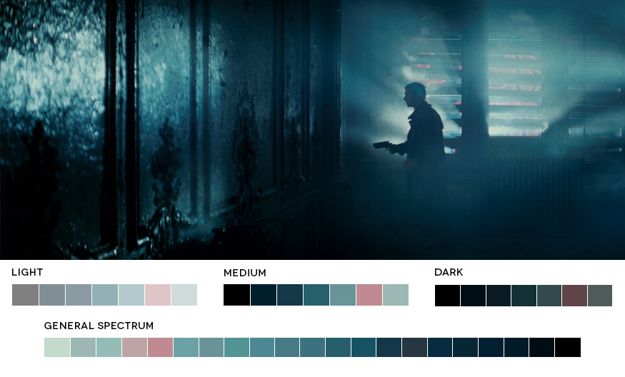
Then it came experimentation with colours and typefaces. The chosen colours are given from my passion to cinematography and urban looks, so it was inspired in films like Blade Runner. I used lighter colours for upper parts and darker for the triangle at the bottom. The typeface has the colour of the two triangles with lighter tone, so the strength in the design is distributed.
After experimenting with different typefaces with the design logo to make sure everything is consistent, I decided to choose a Sans-serif font as it goes better with logo as well as give the brand a relaxed look instead of a more formal one.

I used the book "Stop Stealing Sheep & find out how type works" by Erik Spiekermann to help me find out what typeface I should pick. It was then when Helvetica Neue came across, and it was my favourite typeface before starting the course. After watching the documentary about Helvetica and know what is around this typeface, I think it is a typeface that represents me in some ways. It has been very critisised for its overuse. Everyone wants to be original, but who doesn't? I personally believe that using the same as everyone else doesn't make us be the same or lack of originality. In my opinion, if something is well made, it should be used, and Helvetica is the perfect example. It would be wrong if it is used for absolutely everything without considering other options. But just because it's widely used, it doesn't mean that using it is commiting some kind of sin or heresy. It reflects not only how I think, but how I make my decisions designing: I always try to be practical and I like to take risks, but up to some point. It also conveys, with its shapes, sophistication and simplicity, things that I always try to have in my work.
After checking all the types of Helvetica Neue, the most appropriate seemed Helvetica Neue LT Std 35 Thin, as it wasn't too thin (to avoid printing problems) or too thick that wouldn't represent me. Choosing the intermediate choice is also typical in my design decisions. I chose to keep it in lower case to remove any ideas of hierarchy and convey more simplicity. The use of the name Alex (for Alejandro) it's a choice based on make it easier for an English audience to pronounce and remember.
The size was given by the width of the logo and making it multiple of the size of the lines.

Although I was happy with helvetica, I wanted to check other options, so I took a different way to experiment with typefaces. There is a type of customised searching system for fonts on internet I decided to try. I asked my girlfriend to choose the different elements of a typeface that could define me. The results were horrible, but at least it gave me an idea about what I didn't want for my branding. The interesting thing is that I made the same for her, and she wasn't happy with the results either. So I tried to do it trying to consider myself as a professional rather than my personal attributes. Then some alternatives came up:
http://www.fonts.com/font/itc/itc-ronda/regular
http://www.fonts.com/font/international-typefounders-inc/aquarius/medium
http://www.fonts.com/font/microsoft-corporation/nina/regular
http://www.fonts.com/font/linotype/stymie/medium
http://www.fonts.com/font/shinntype/preface/book
http://www.fonts.com/font/identikal/monark/light
http://www.fonts.com/font/font-bureau/pennsylvania/regular
Among all of them I'd highlight ITC Ronda as it can make an interesting contrast with its rounded shapes and the triangle. Despite I think Helvetica Neue works quite well with the logo I am not sure about the lack of personality of the typeface being a Graphic Designer myself. ITC Ronda is, after all, a bit bolder, naturally enhancing some features the typeface already has, like the unusual shapes of the "a" and the "e", making it more suitable for a graphic designer identity logo.

No comments:
Post a Comment