Here I'm posting part of the evolution of the design, but what I would highlight of this project is the good communication between my friend and me. The design has been progressing as he has been participating in the design decissions and in feedback sessions with other friends. I think this is very positive because I learn a lot from people outside of the graphic design world and also he feels safe because I'm not doing whatever I want. He feels he is part of the process, and that's very important to me. There is no point in designing something beautiful and great if he is not part of it.
The actual status of the design is the woman with the butterfly on her face. The meaning is quite metaphorical: the butterfly represents the evolution, from being a larva to be a beautiful butterfly. But that evolution keeps us sometimes in the darkness, avoiding us to see the reality.
The texture on the butterfly is inspired by a scientific investigation about how tears' molecular composition varies depending on the reason why those tears have been produced. The tears from grief have a very specific aspect:
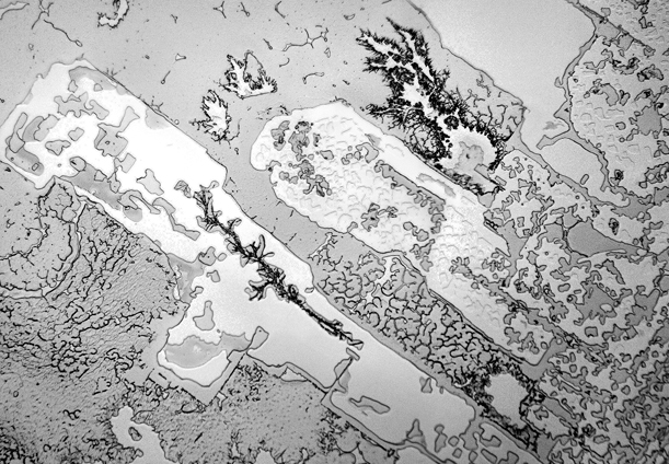
We both identified some kind of map, representing a city on a coast or something similar. I proposed to use a map picture, since this images are copyrighted. So I used a picture from the space of a coast side in Alaska, which its coldness also goes along with the whole meaning previously explained.


The design is not finished yet. There are some things that need to be polished, but so far this project has been very teaching.
No comments:
Post a Comment